
We recently went through the process to rebrand our business, along with the rollout of our own website. These are the first steps towards focusing the business away from Etsy and onto our own independent platform, which felt like a great time give the logo a refresh. While I was prepared for fun new imagery, ordering packaging materials etc., I was NOT prepared for the emotional journey something as simple as a logo could take me through.
The original logo had worked just fine for several years but felt a bit soft and didn't seem to reflect where we were heading with the business. So we hired my amazing cousin as a graphic designer to work up something fresh and new for us. The project requirements were:
- Punchier color
- Mid-century inspired but not TOO mid-century
- More sophisticated
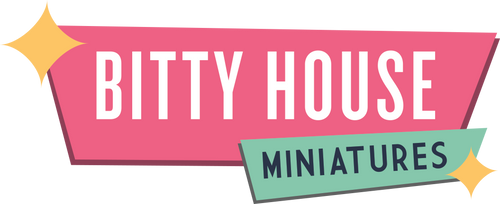
You guys, I'm here to tell you she NAILED it. When I saw the first proofs of the new logo I cried. It was so validating to see this little spark of an idea, nurtured through the pandemic when we (and everyone else) needed a bright spot to get through the dark days, now growing up into full-time business with a big girl logo. We still have a long ways to go but this felt like we made it in some way. And just like the logo has evolved, matured and become more sophisticated, so too is the business. They are a reflection of each other. They say a brand is more than a logo and I'd say that a logo is bigger than an image.
~Lorianna